
胡大饭馆
Hu Da Restaurant
北京簋街三店
Words by 胡大 | Published on 13-02-2019 | Design by IN.X |
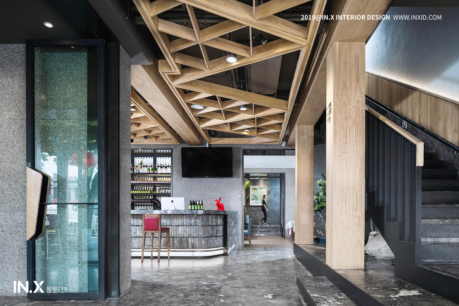
胡大饭店三店为其品牌的旗舰店,室内设计由设计师吴为操刀,在原店面的基础上,从动线、材质、工艺等不同方向进行变革式的设计,打造既充满传统文化底蕴,又不失现代休闲感的餐饮空间。胡大三店原有的使用空间分布零散,缺失视觉上到空间关系上的关联性,虽然每日营业时的状况火爆,但也会造成对品牌形象的认知弱化,时间长久便会演变为客户群体的流失。
The three stores of Huda Hotel are the flagship stores of the brand. The interior design is designed by the designer Wu Wei. On the basis of the original storefront, the transformation design is carried out in different directions, such as moving lines, materials and crafts, to create a traditional cultural heritage. A modern and casual dining space. The original use space of Hu Dasan store is scattered, lacking the visual-to-spatial relationship. Although the daily business is hot, it will also weaken the perception of the brand image, and it will evolve into a customer group for a long time.
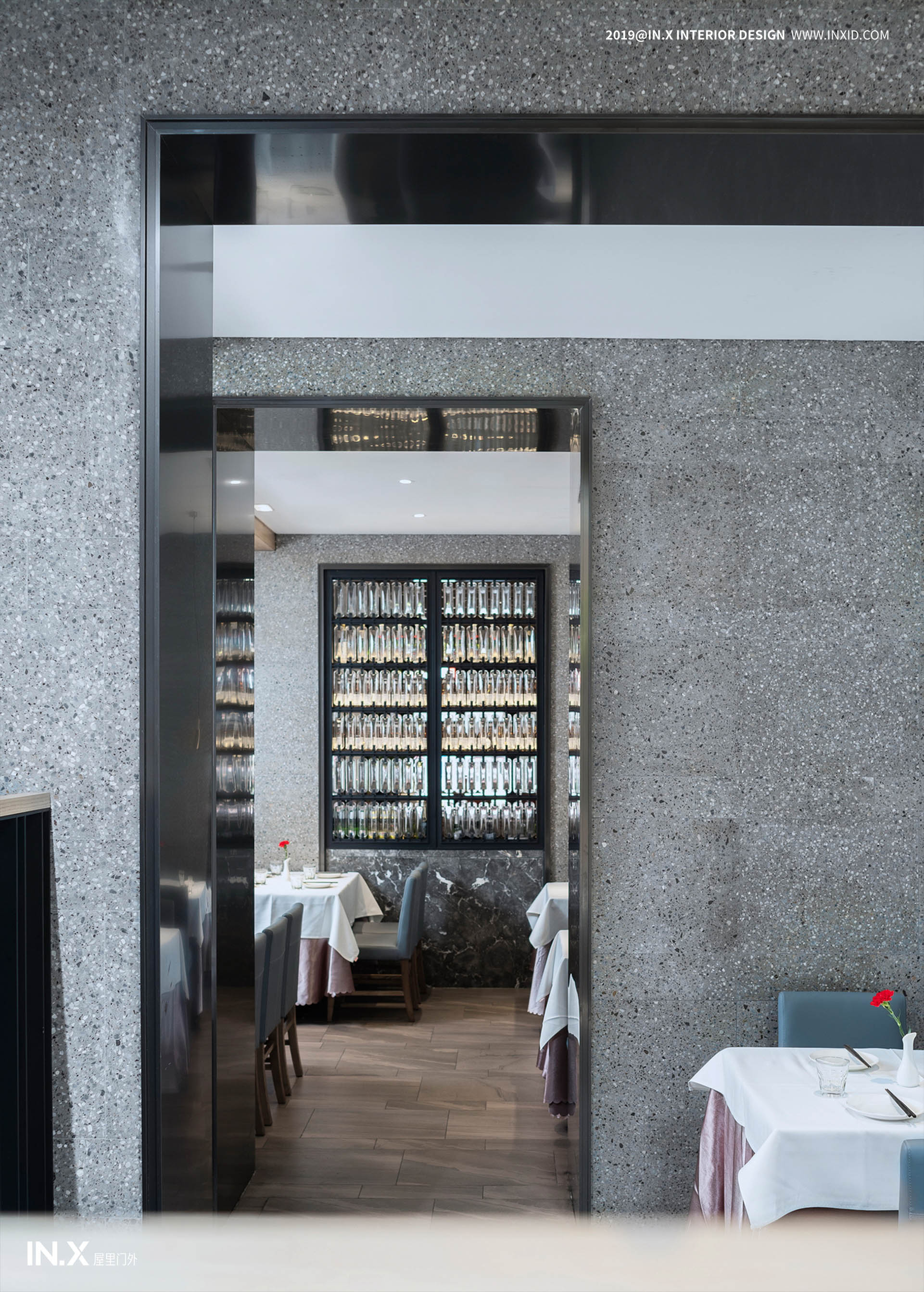
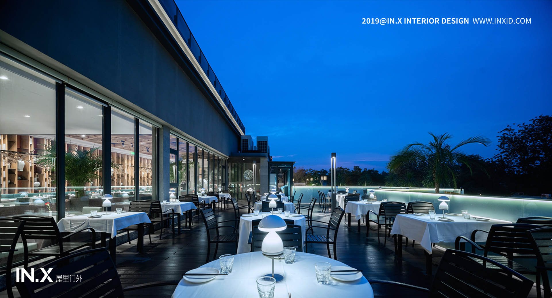
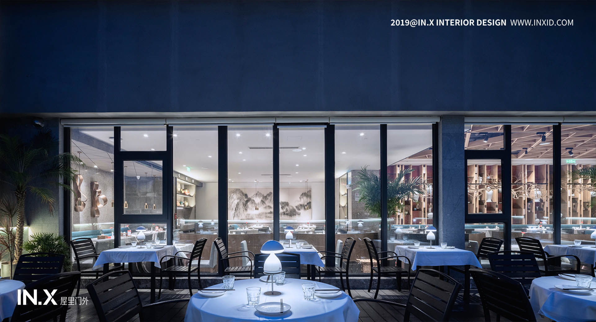
设计师对三店的原始空间做了平面上的功能优化,又增加了三层包房区域以及室外的露台散座区,大大增加了使用面积,也将每一处空间贯通连接。创造力是设计的本质所在,于餐饮空间而言,亦是。在过去,胡大饭馆给大家留下的印象普遍是热闹、嘈杂,环境一般,桌椅尺寸局促,为了提升翻台率摆放过于紧凑,所以在此次设计中也着重考虑加强客户的用餐体验感,从而提升品牌价值。
The designer made a function optimization on the plane of the original space of the three stores, and added a three-storey private room area and an outdoor terraced seating area, which greatly increased the use area and also connected each space. Creativity is the essence of design, and in terms of dining space, it is also. In the past, the impression that Hu Da Restaurant left for everyone was generally lively and noisy, the environment was general, the size of tables and chairs was cramped, and in order to increase the rate of overturning, it was too compact, so in this design, we also focused on strengthening the dining experience of customers. Sense, thereby enhancing brand value.

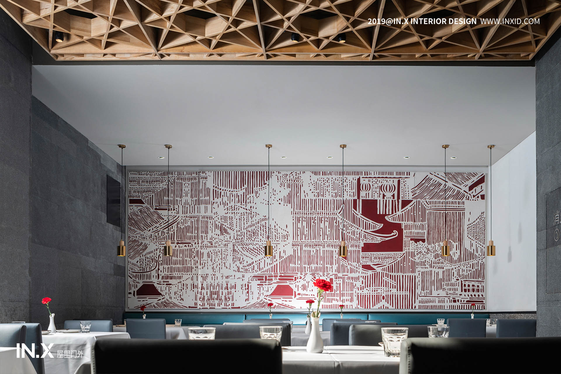
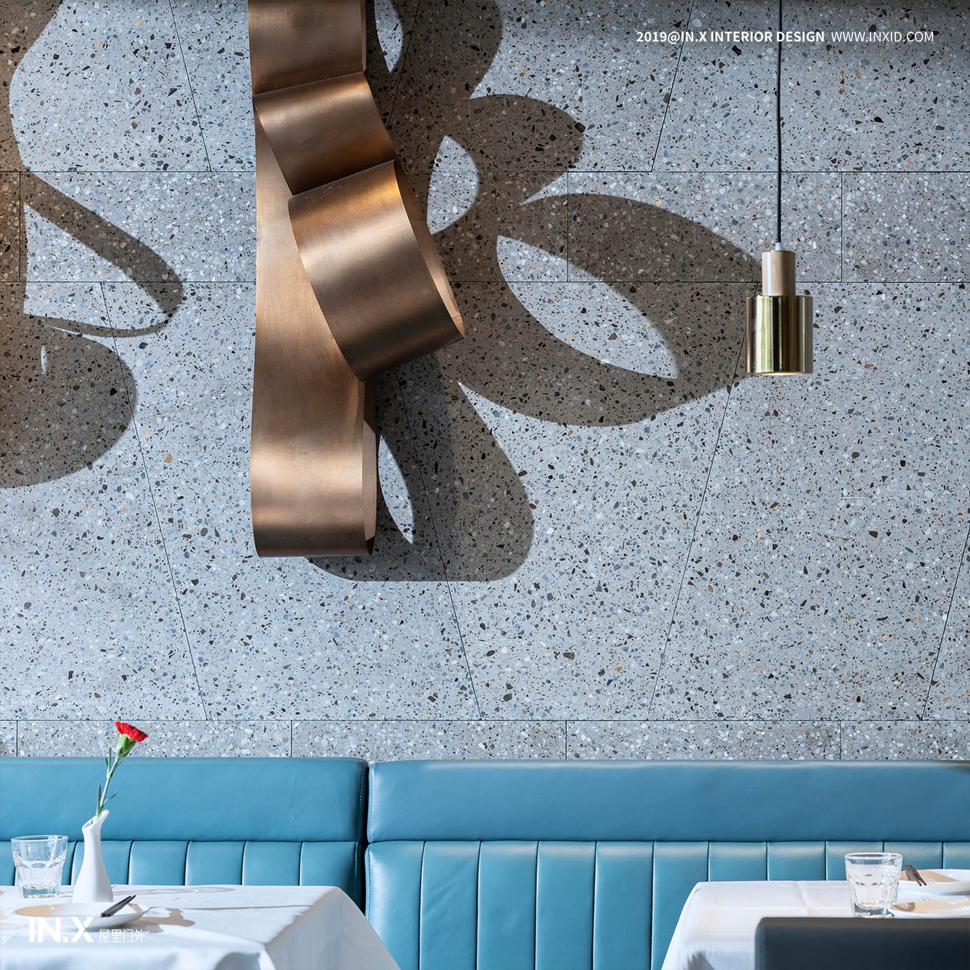
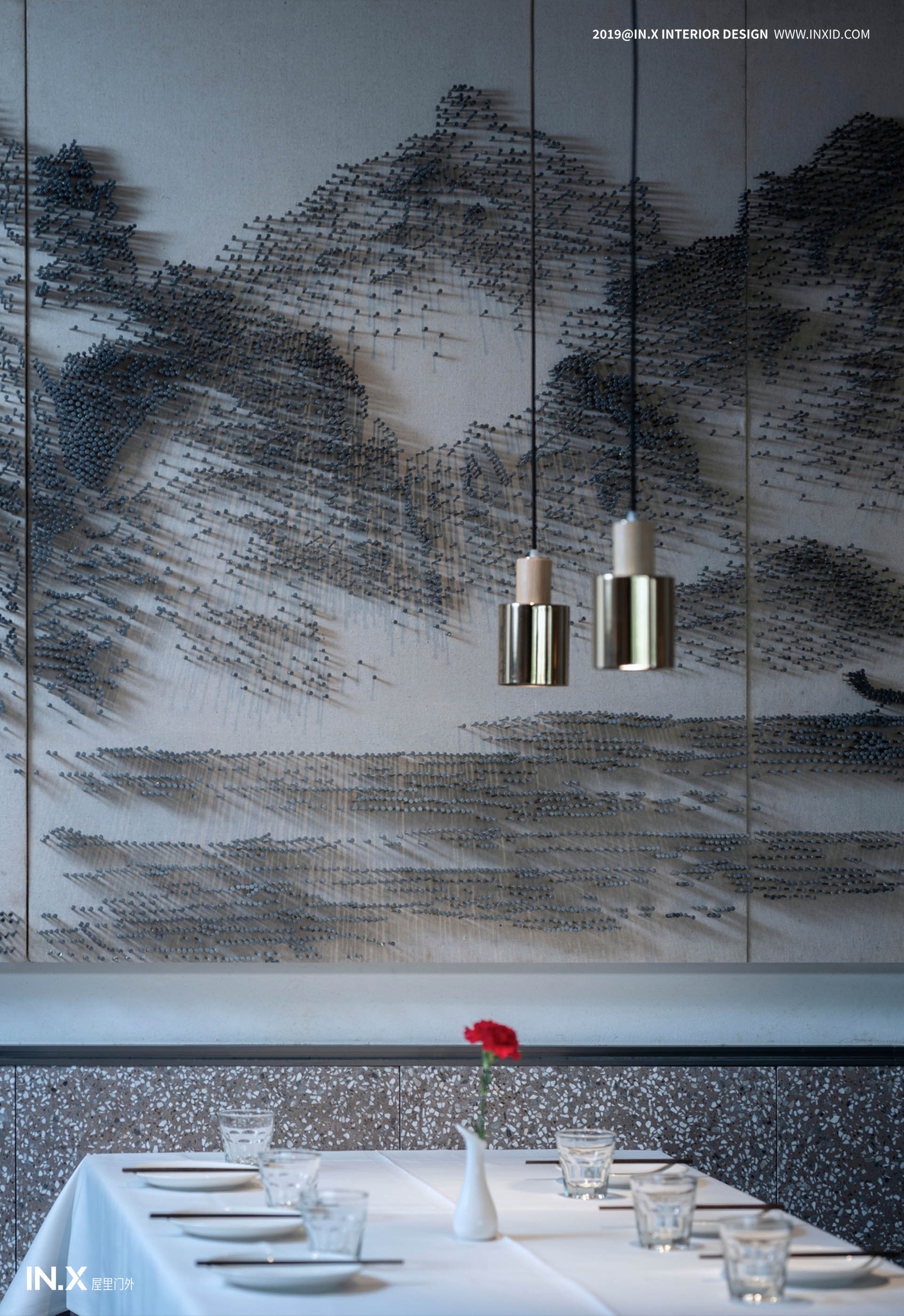
极尽现代的用色之余,艺术品的配置仍为空间的一大亮点,墙面施以大面积剪纸形式的平面装饰,以红白相间的皇城建筑、园林艺术为主题,将目光引至此处,也是用意将胡大的地域文化着力放大。灰色冷冽的墙面打破对街景文化固有的认知,似将高涨的情绪进行平衡,层层递进,不同材质的转换,丰富视觉效果。秩序性是仪式感的必要条件,以中轴线为主,两侧俨然对称,无形之中将皇家礼序娓娓道来,潜移默化深入到用餐者的日常之中。
With the most modern use of color, the arrangement of artworks is still a highlight of the space. The wall is decorated with a large area of paper-cut, with the theme of red and white imperial city architecture and garden art. Up to here, it is also intended to enlarge Hu Da’s regional culture. The gray, cold wall breaks the inherent perception of the streetscape culture, and it seems to balance the rising emotions, progressively, and transforming different materials to enrich the visual effects. Order is a necessary condition for the sense of ritual. It is dominated by the central axis, and the two sides are completely symmetrical. Invisible, the imperial order is sung, and it is subtly deepened into the daily life of the diners.
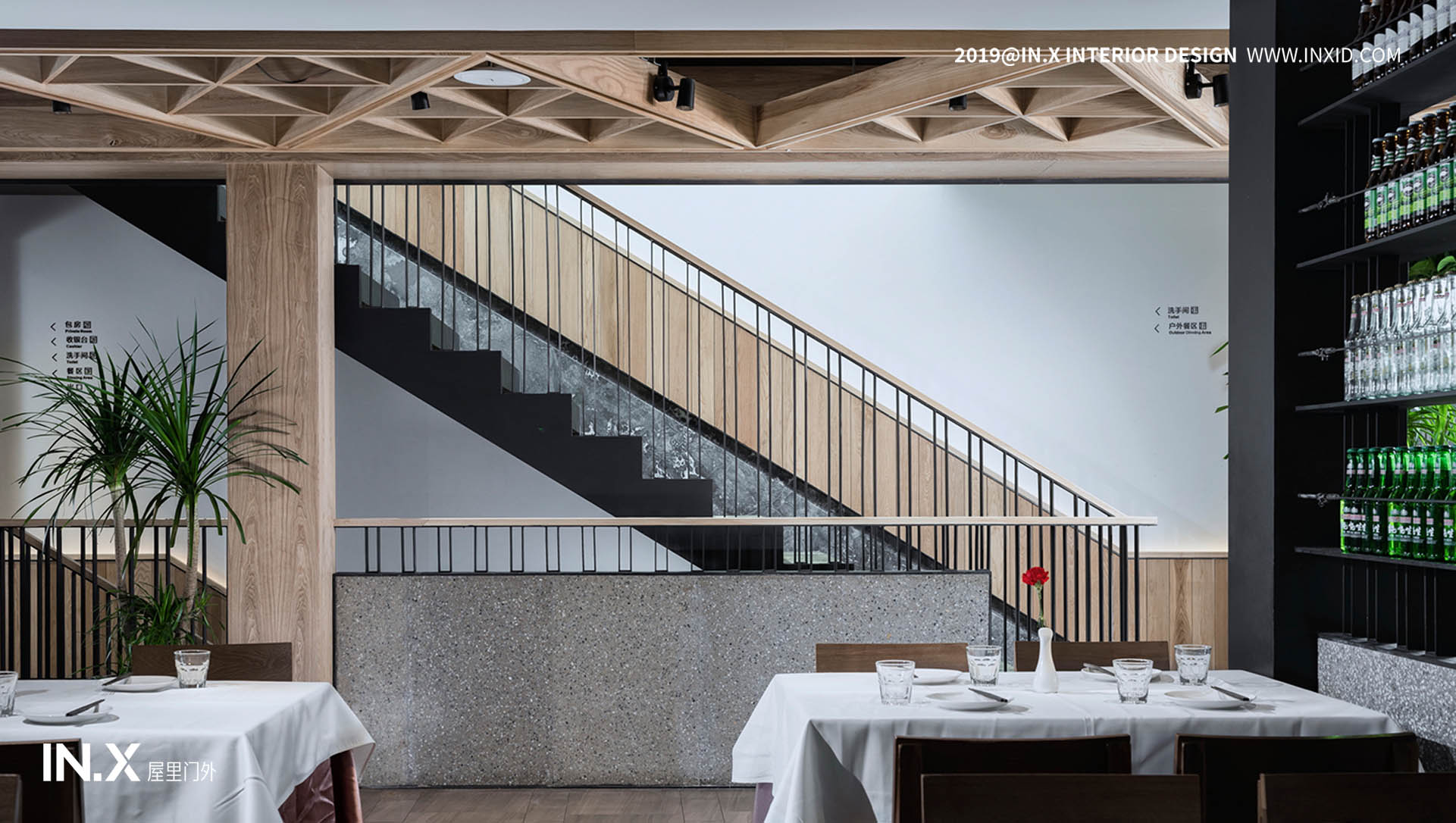
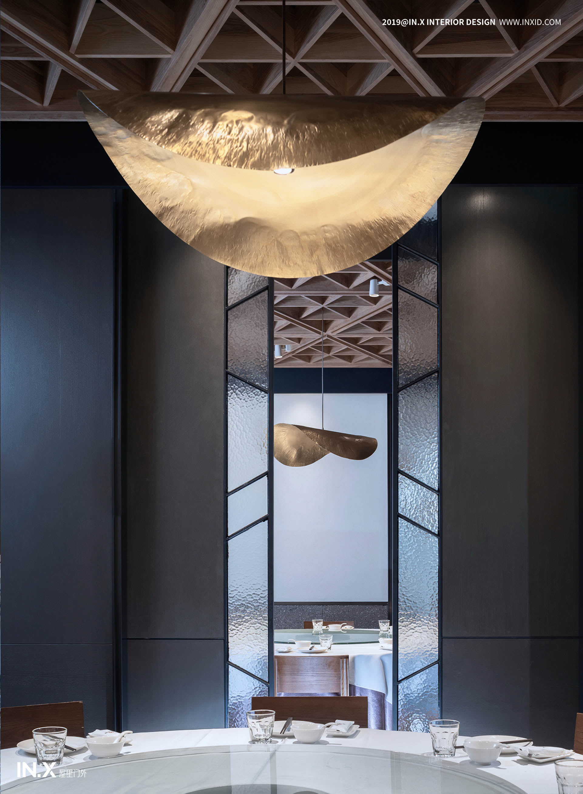
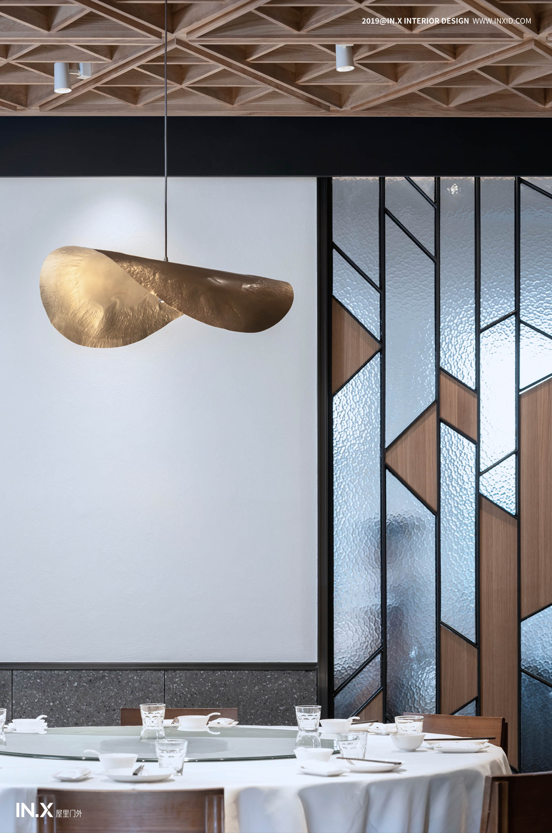
视觉是对于空间的第一感受,颜色带来深度、自信以及无限可能,神秘的面纱下蕴藏着无穷的力量与魅力,设计师将包间的墙面颜色覆以哑光的黑色,与金色吊灯相辉映,将低奢隐于简洁之中。木质的吊顶做为贯穿始终的设计语言,造型富于变化,几何造型将空间的氛围调动起来。同时,空间增添新的活力,保留老客户,又拓展更多有品质要求的新客户,让胡大在市场上的包容性更大,以及让客人对胡大产生更紧密的追随。
Vision is the first feeling for space. Color brings depth, confidence and infinite possibilities. Under the veil of mystery, there is endless power and charm. The designer will cover the wall color of the room with matte black, and the golden chandelier. Hui Ying, the low luxury is hidden in the simplicity. The wooden ceiling is the design language throughout, the shape is rich and varied, and the geometric shape mobilizes the atmosphere of the space. At the same time, space adds new vitality, retains old customers, and expands more new customers with quality requirements, making Hu Da more inclusive in the market, and allowing customers to follow Hu Da more closely.
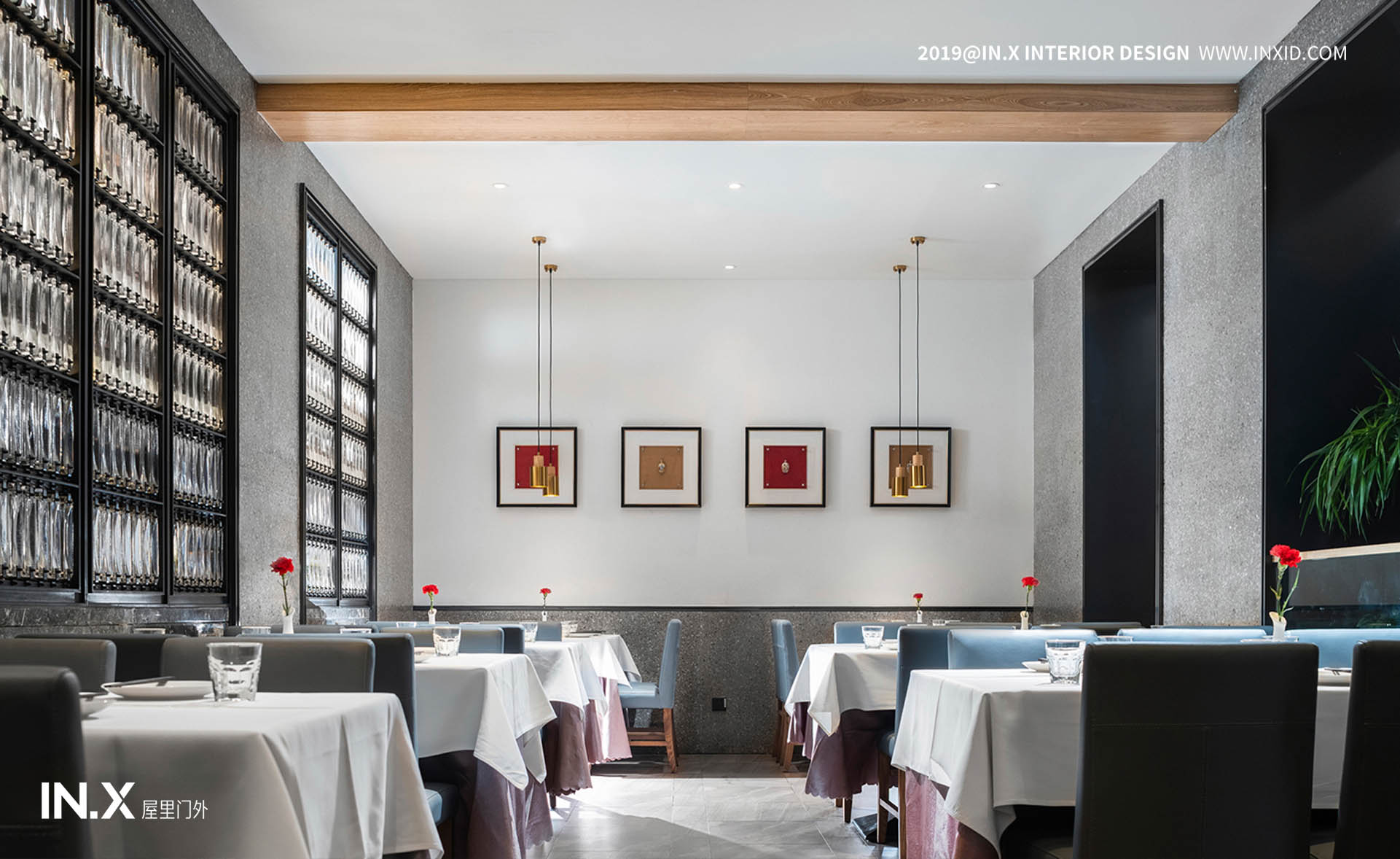
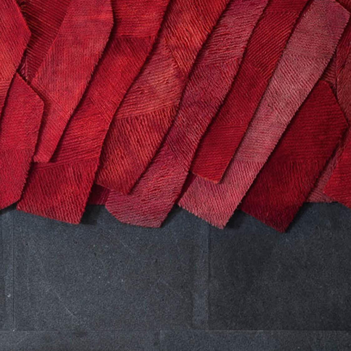
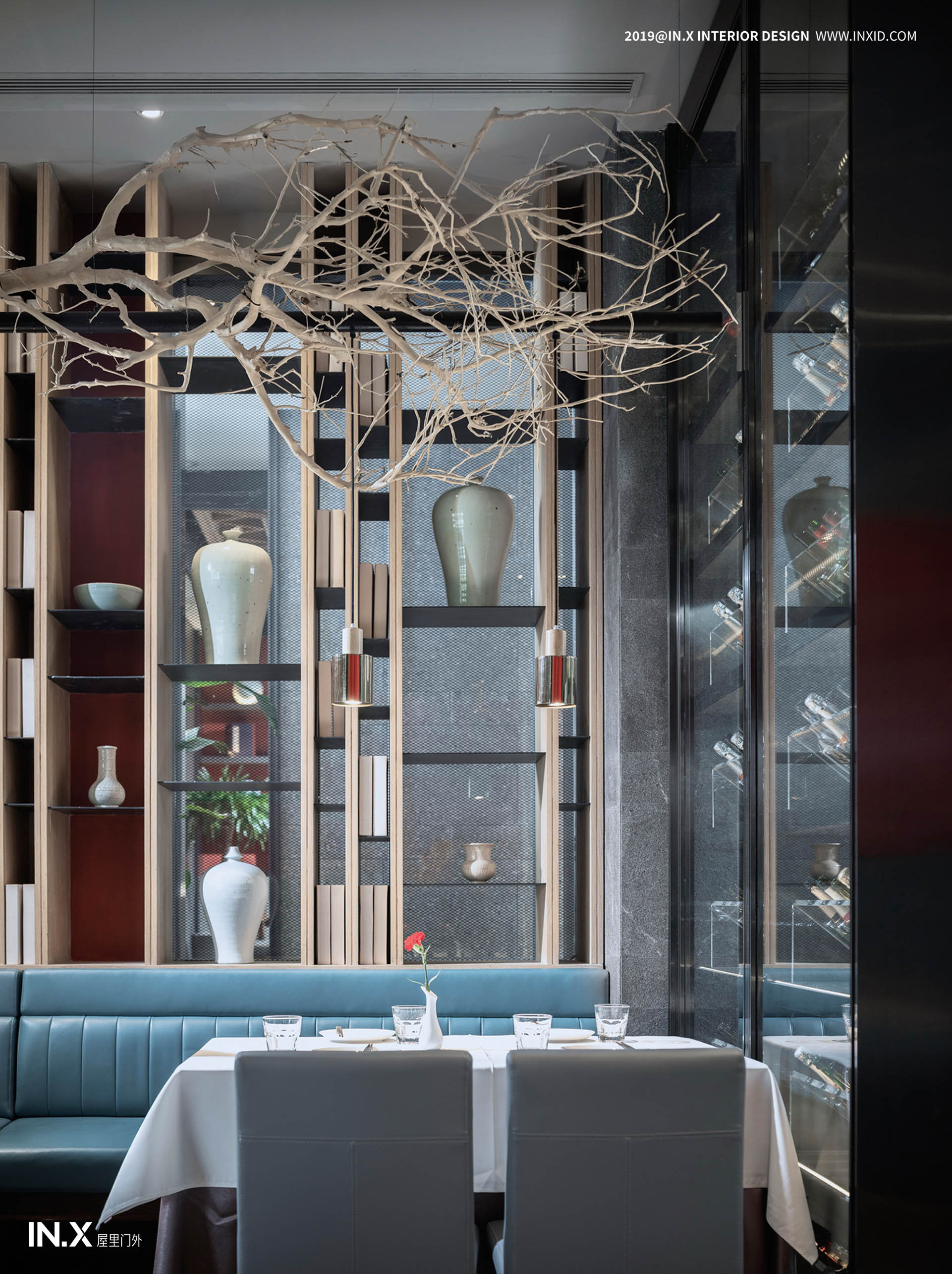
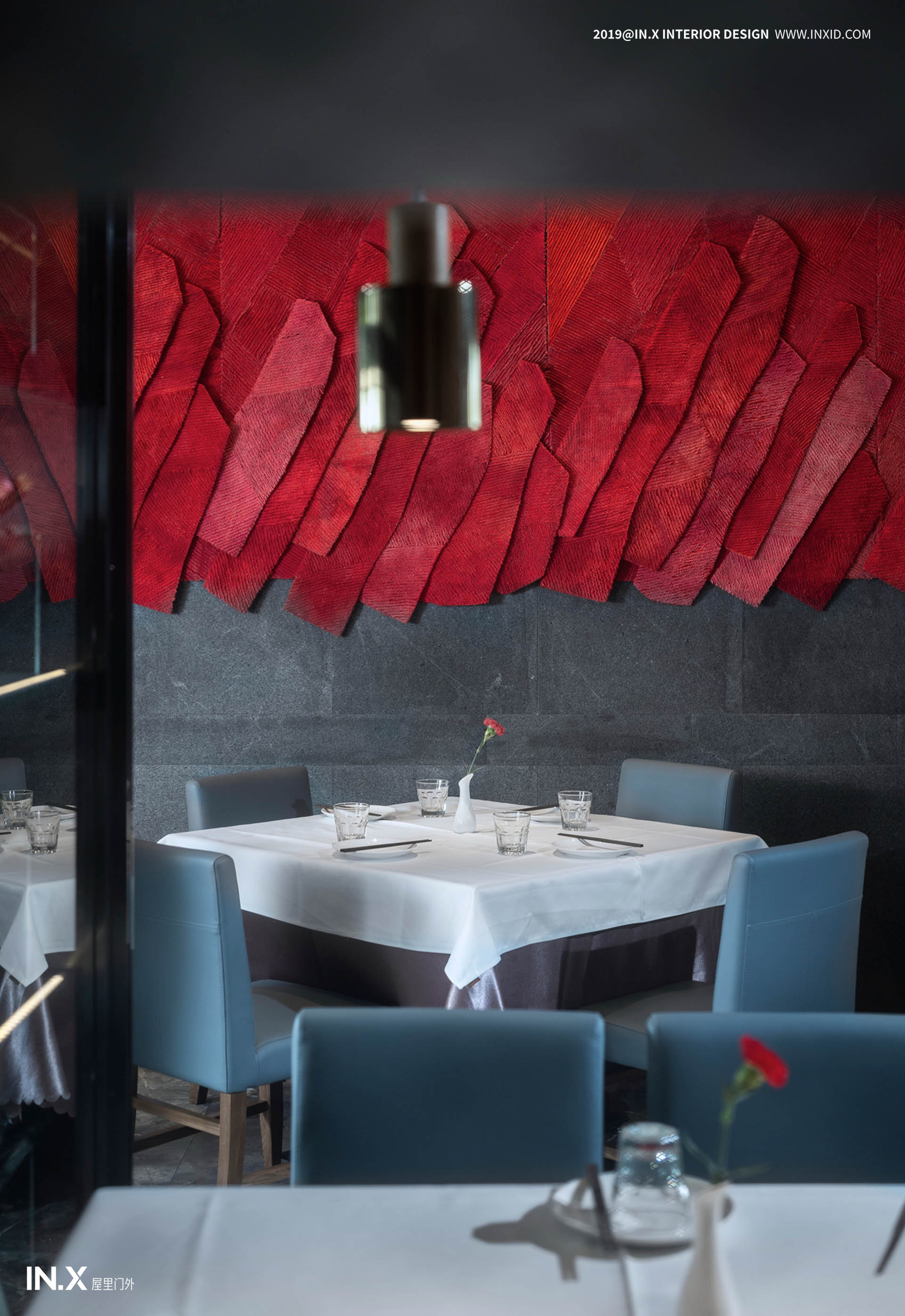
在胡大三店的空间中,设计师在多处使用了大体量的艺术装置,呈现其凛然大气,作为标志性的红色,自然不可或缺,居于室内,它的张力成为缓解视觉疲劳的重要一笔,移步之间,自有趣味。墙面上安置的红色纤维艺术装置,来自于林丽琼老师历时数月的创作。纤维艺术以其柔软的质感、材料的传统、情感的寄寓、创意的表达,最能以温暖深入人心。设计是在塑造一种生活方式,借此赋予我们对于未来的希冀。餐厅向外移至露台,在夜幕垂落之际,饱览独属京城的视野,感受当下的生活。
In the space of Hudasandian, the designer used a large amount of art installations in many places to present its atmosphere. As a symbolic red, it is indispensable and indoors. Its tension has become an important part of relieving visual fatigue. Between the steps, it’s interesting. The red fiber art installation placed on the wall comes from the creation of Mr. Lin Liqiong for several months. With its soft texture, traditional materials, emotional expressions and creative expressions, fiber art can best reach people's hearts with warmth. Design is shaping a way of life that gives us hope for the future. The restaurant moves outwards to the terrace, and when the night falls, you can enjoy the sights of the exclusive capital and feel the present life.

项目信息
项目地址:北京簋街
项目名称:胡大饭馆
设计公司:北京IN•X屋里门外设计公司
设计主创:吴为 www.inxid.com
设计团队 : 刘晨阳 贾琦峰 应哲光 唐尧
设计面积:1550㎡
完工时间:2019年2月
项目摄影:史云峰
Project information
Project address: Beijing Street
Project Name: Hu Da Restaurant
Design company: Beijing IN•X House Interior Design Company
Design master: Wu Wei www.inxid.com
Design Team : Liu Chenyang Jia Qifeng Ying Zheguang Tang Wei
Design area: 1550m2
Completion time: February 2019
Project Photography: Shi Yunfeng
扫描二维码分享到微信