
潇湘码头
Xiaoxiang Matou
渔宴丽泽店
Words by 潇湘码头 | Published on 9-02-2023 | Design by IN.X |
本项目中,餐厅空间是品牌与城市、自然、文化关系的素描,承载味觉之外,空间更要刻画记忆、激发情感、塑造品牌。
The restaurant space is a sketch of the relationship between the brand and the city, nature, and culture.
In addition to carrying the sense of taste, the space should also portray memory, stimulate emotion, and shape the brand.
在北京丽泽金融街商业楼内,老牌湘菜连锁品牌潇湘码头在京第6家连锁店以“鱼”作为更鲜明的品类主打——潇湘码头·渔宴开席。多年专注于菜系口味而未在空间体验上过多着力,让潇湘码头始终处于名不见经传的深巷里,品牌委托IN.X屋里门外通过空间设计实现品牌升级。
In the commercial building of Lize Financial Street in Beijing, the sixth chain store of the old Hunan cuisine chain brand Xiaoxiang Wharf in Beijing uses "fish" as a more distinctive category - Xiaoxiang Wharf Fishing Banquet. Focusing on the taste of cuisine for many years without paying too much attention to space experience, Xiaoxiang Wharf has always been in an unknown deep alley. The brand commissioned IN.X to upgrade the brand through space design.
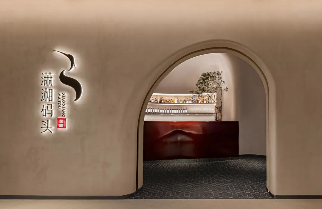
设计师希望贴合湘菜品类文化完成在地化的空间构建,并创出潇湘码头能够深入人心的品牌形象,这一策略引导了整体空间构建。
The designer hopes to complete the localized space construction in line with the Hunan cuisine category culture, and create a brand image of Xiaoxiang Wharf that can be deeply rooted in the hearts of the people. This strategy guides the overall space construction.
01. 文化
文化深处的链接 | Links to Deep Culture
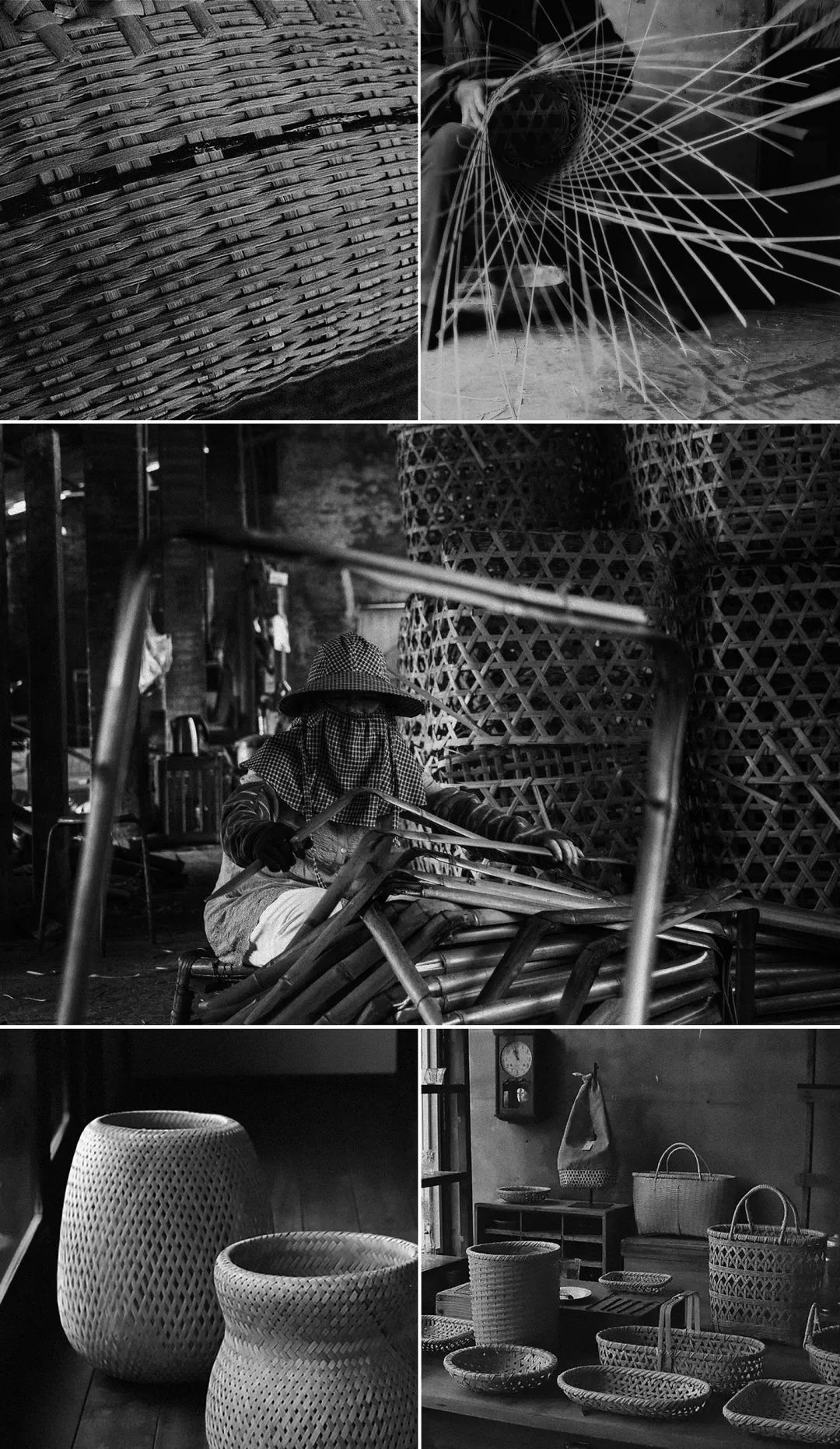
在设计师吴为看来,向后退一步、向深处进一步,往往能更准确地找到品牌与自然、文化的连接。溯源至距今七千余年的湖南高庙文化时期,传统竹编工艺业已发源,竹编器皿千百年来记载三湘大地悠悠岁月,衣食住行皆被轻盈竹篾经纬串联,是编入了人们先验记忆里的“湘情”。
In the view of designer Wu Wei, taking a step back and going deeper can often find the connection between the brand and nature and culture more accurately. Dating back to the Gaomiao culture period in Hunan more than 7,000 years ago, the traditional bamboo weaving craft has already originated. Bamboo weaving vessels have recorded the long years of the land of Sanxiang for thousands of years. "Xiangqing" in memory.
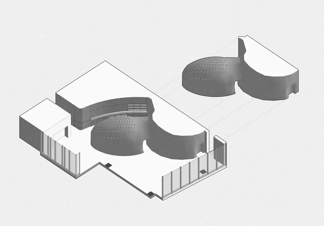
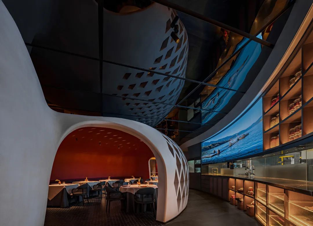
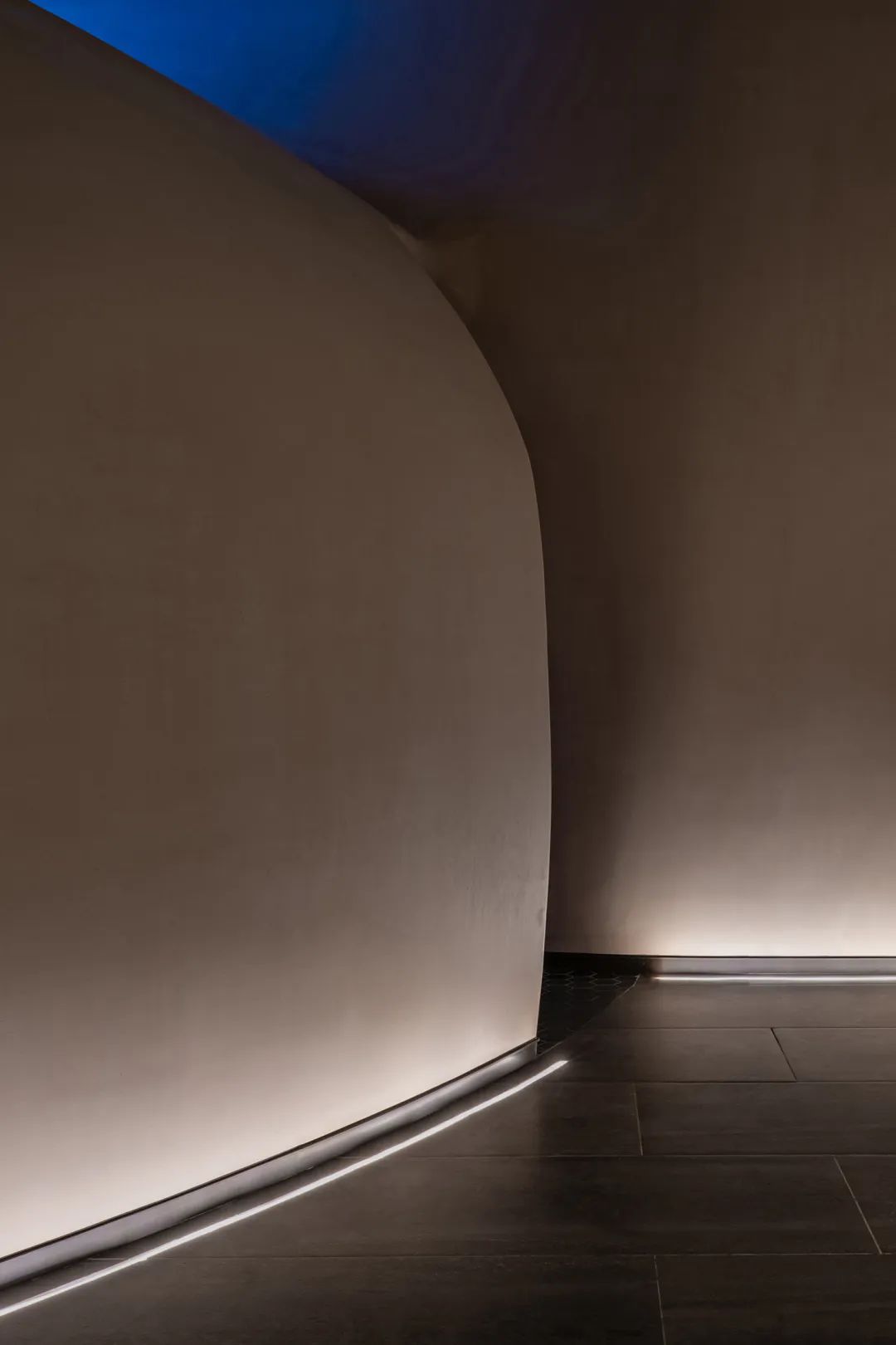
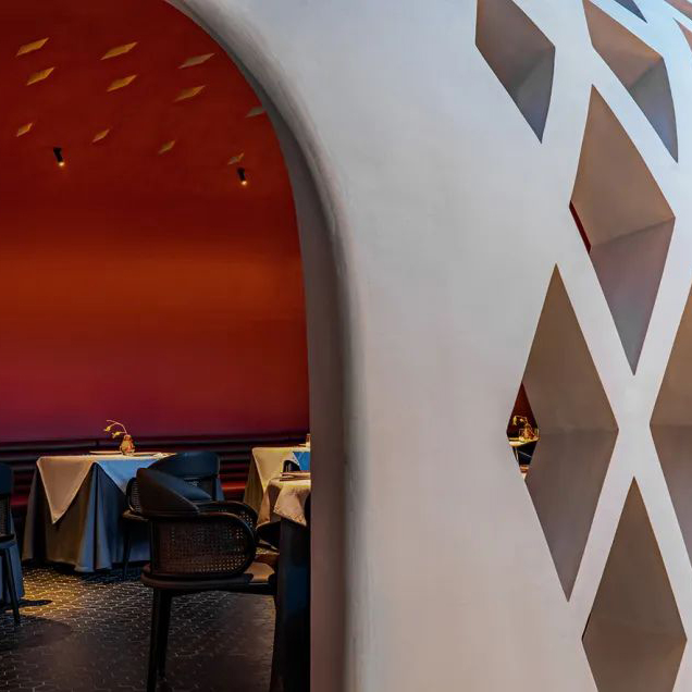
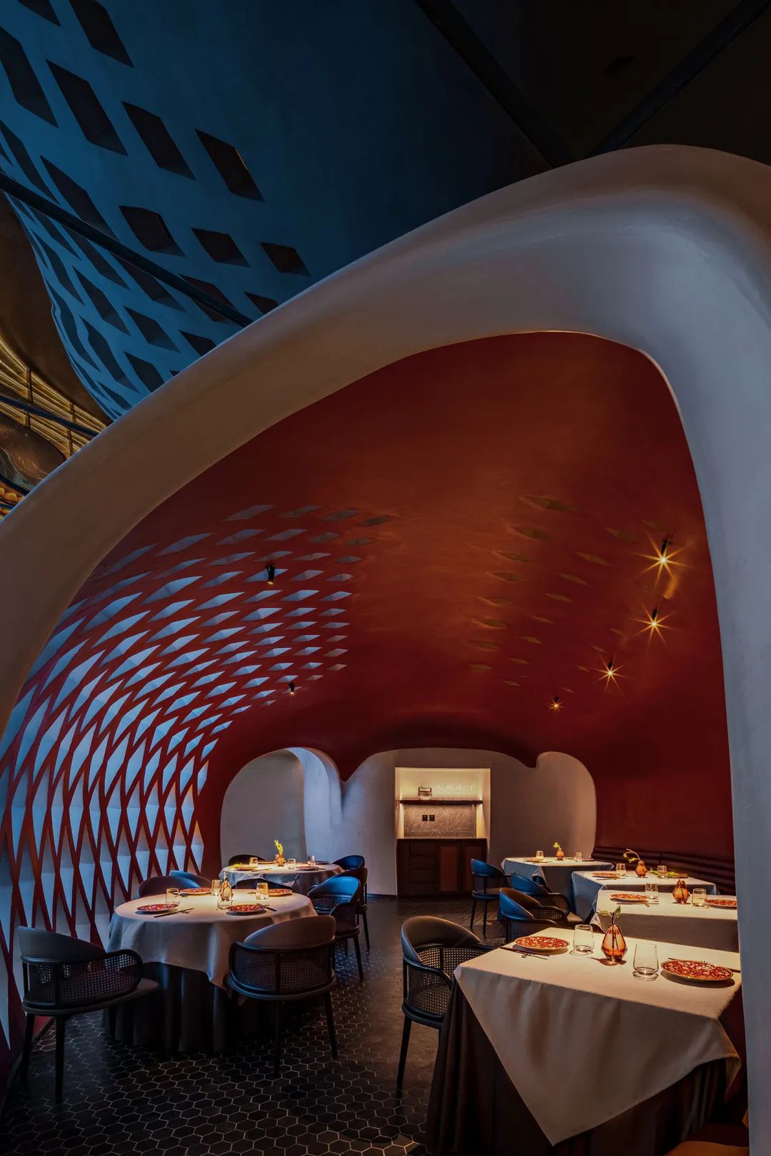
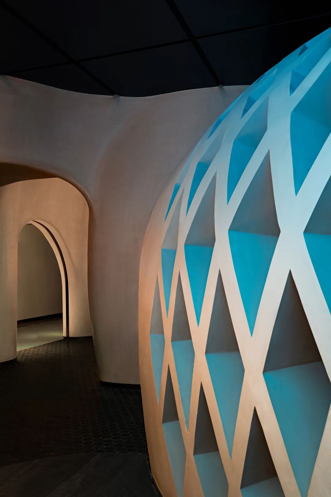
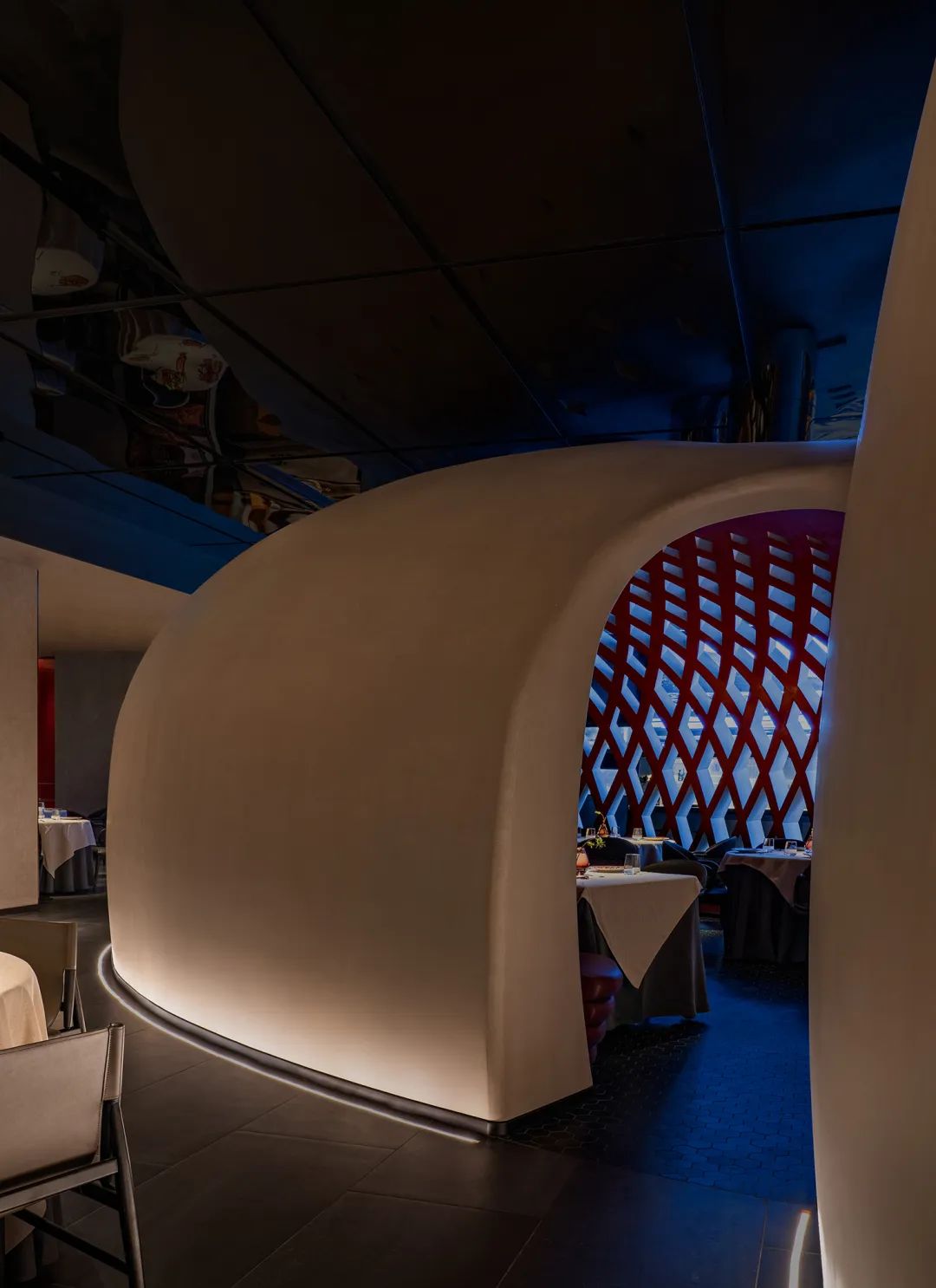
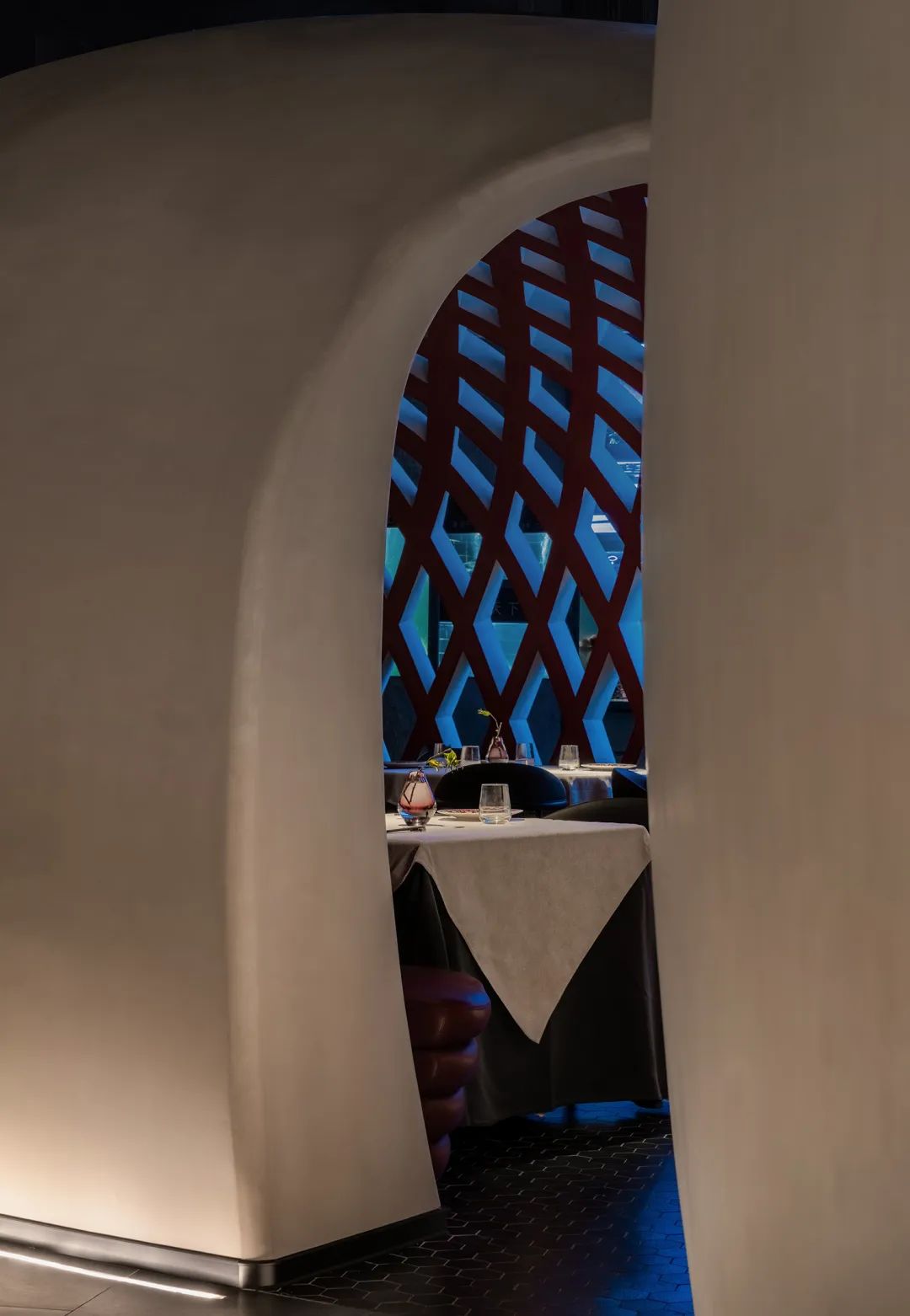
经过对商业楼内餐厅环境与功能需诉求分析,设计从非遗竹编中吸取灵感——将竹编器皿与当代就餐空间结合,解构、放大后在主空间完成两个体量较大的白色“腔体”,这组在坚硬的现代空间内部生长出来的柔软建筑强化了整体的现代感,但同时又以其圆润自然的外部和历史深处的文化指向完成了品牌基因地表达。
After analyzing the environment and functional requirements of restaurants in commercial buildings, the design draws inspiration from intangible cultural heritage bamboo weaving—combining bamboo weaving utensils with contemporary dining spaces, deconstructing and enlarging them to complete two large white "cavities" in the main space ", this group of soft buildings growing out of the hard modern space strengthens the overall sense of modernity, but at the same time, it completes the expression of the brand's genes with its round and natural exterior and cultural references deep in history.
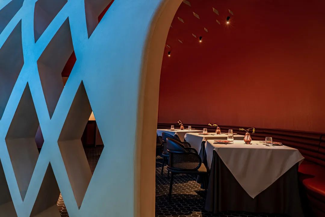
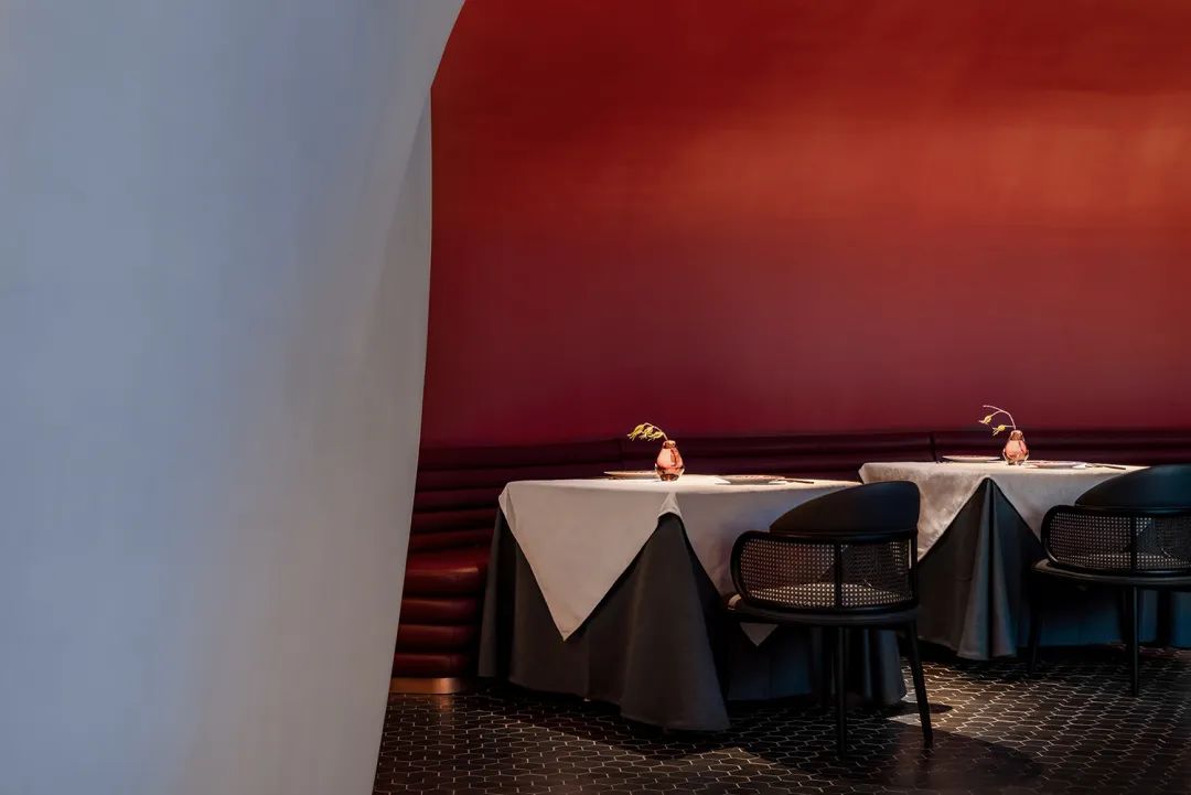
受限于施工难度和成本,腔体建造未能以3D打印技术实现,而是以更传统的钢筋结构层层搭建,现场对形态、曲面及细部的校准同步进行,这一具有实验性的创造由许多人共同完成,最终得到和设计原稿接近的结构体。
曾经在一人指尖的竹篾编织转化为钢筋水泥的巨型构建,坚硬沉重的现代材料被巧妙地轻轻放下——时间已飞逝,而烟火气与匠人之心永续。
Due to the difficulty and cost of construction, the construction of the cavity cannot be realized with 3D printing technology, but is built layer by layer with a more traditional steel structure, and the calibration of the shape, surface and details is carried out simultaneously on site. This is an experimental creation. It was completed by many people, and finally a structure close to the original design was obtained.
The bamboo weaving once at the fingertips of one person has been transformed into a giant structure of reinforced concrete, and the hard and heavy modern materials have been skillfully put down gently - time has flown, but the pyrotechnics and the heart of the craftsman will last forever.
02. 空间
平衡情绪颗粒 | Spatial Balance Mood Granules
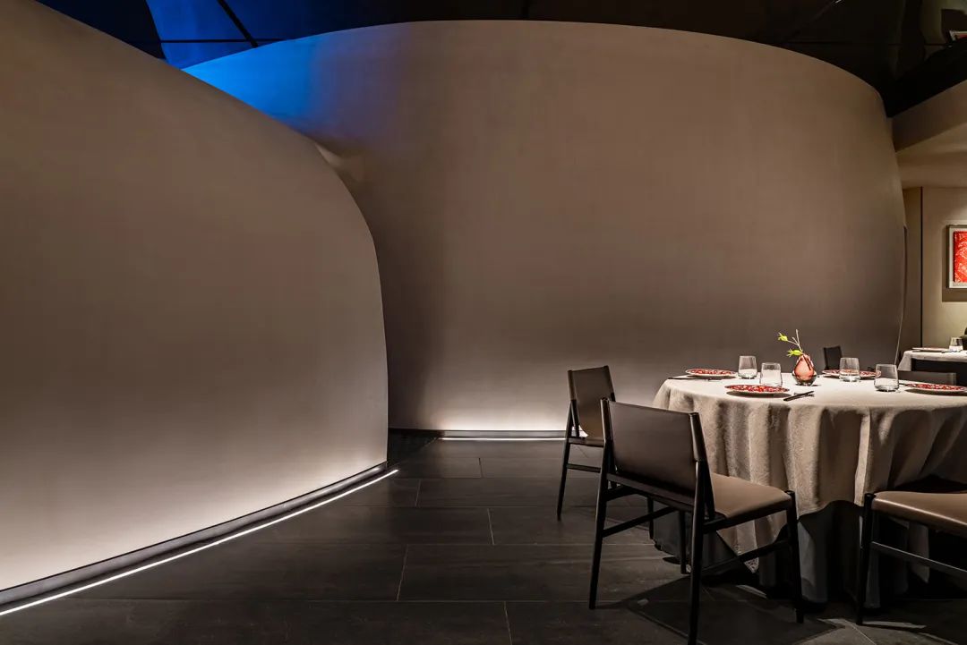
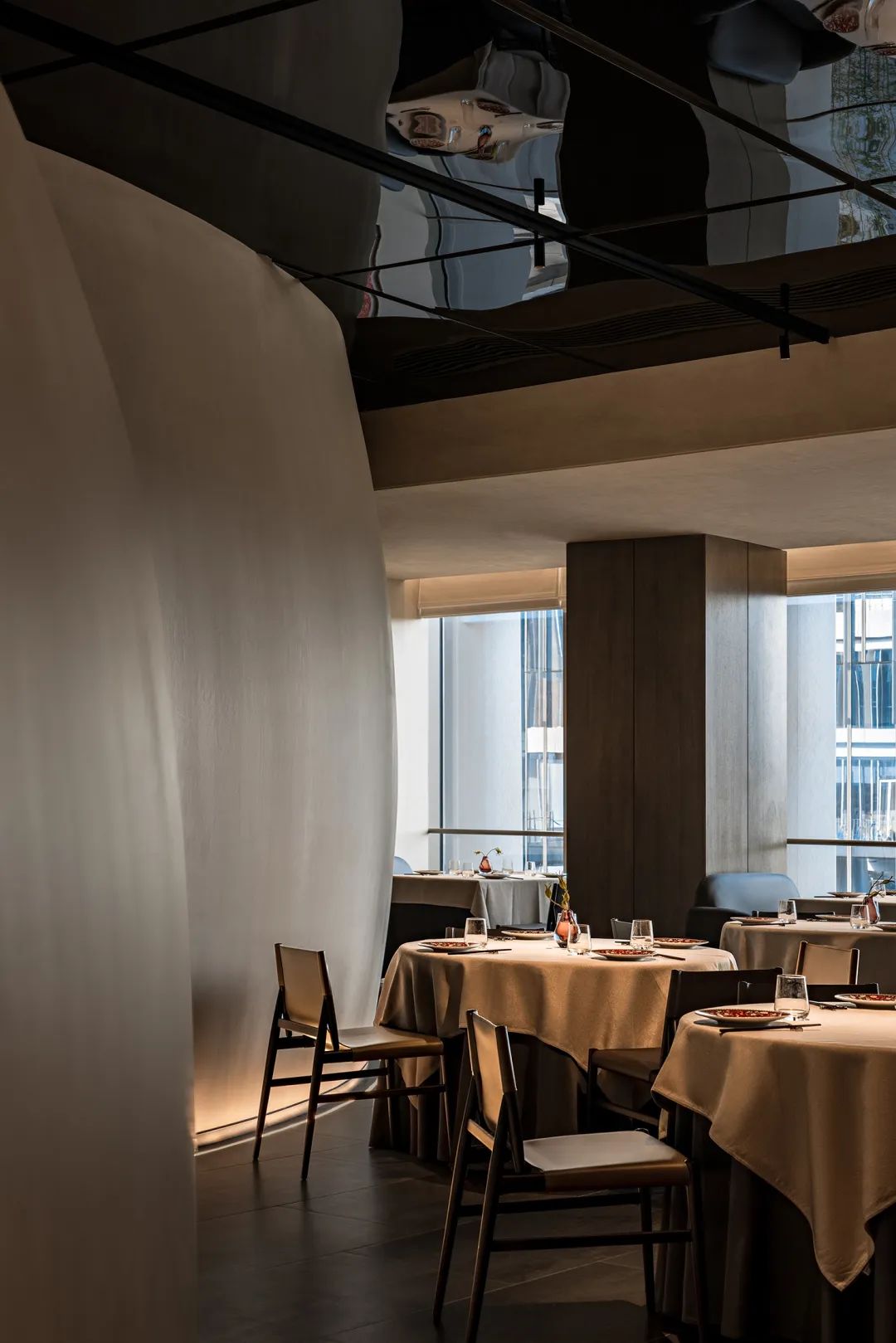
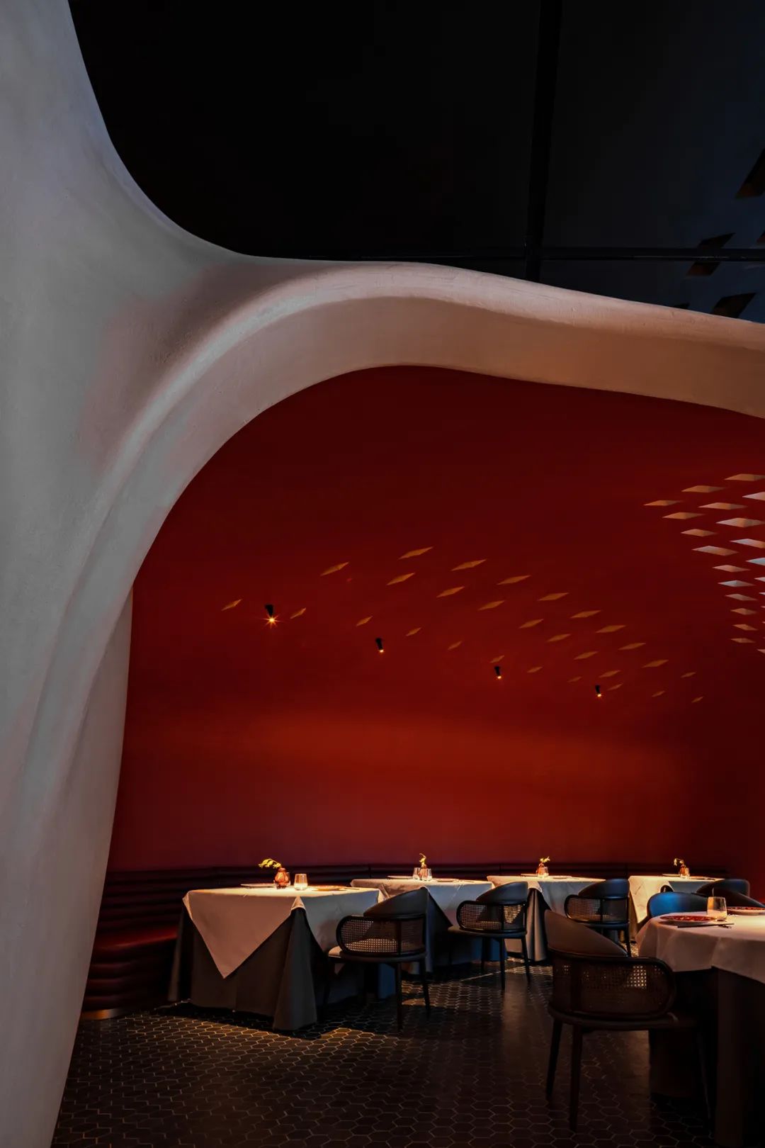
在相对紧凑的内部,腔体结构一方面将空间二次分隔,创造了内部的内部,另一方面作为开放区的雕塑景观与视觉焦点,高效破解了空间和视觉的双重议题。
In the relatively compact interior, on the one hand, the cavity structure divides the space twice to create the inner interior; on the other hand, it serves as the sculpture landscape and visual focus of the open area, effectively solving the dual issues of space and vision.
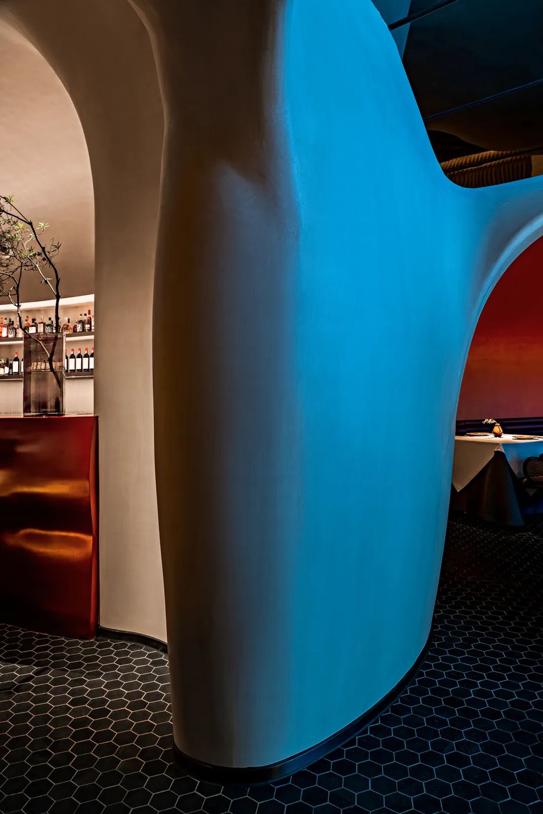
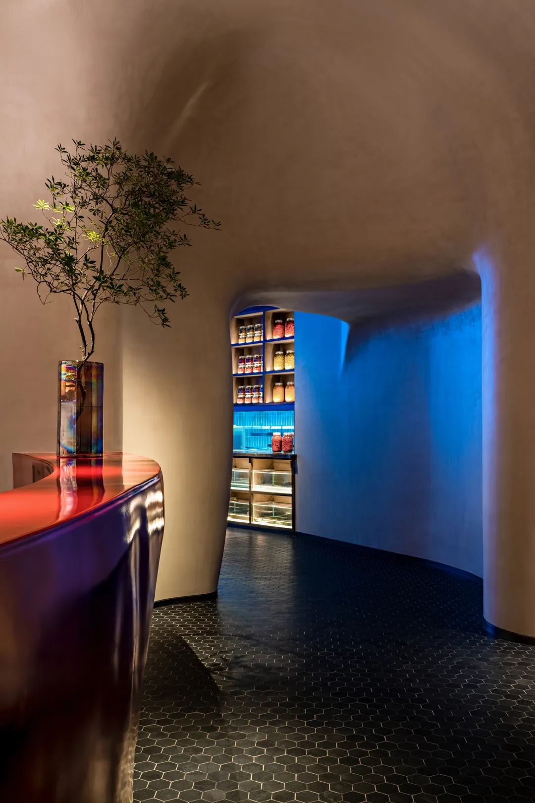
更大尺度上——素色大块面以柔和的曲线将就餐区围拢在当代氛围里;三角形木饰面错落拼贴,构成“编织”视效,与中心腔体表面的编织镂空彼此呼应、点题。
On a larger scale - the plain color large surface surrounds the dining area with soft curves in a contemporary atmosphere; the triangular wood veneer is scattered and collaged to form a "woven" visual effect, echoing the woven hollow on the surface of the central cavity, Questions.
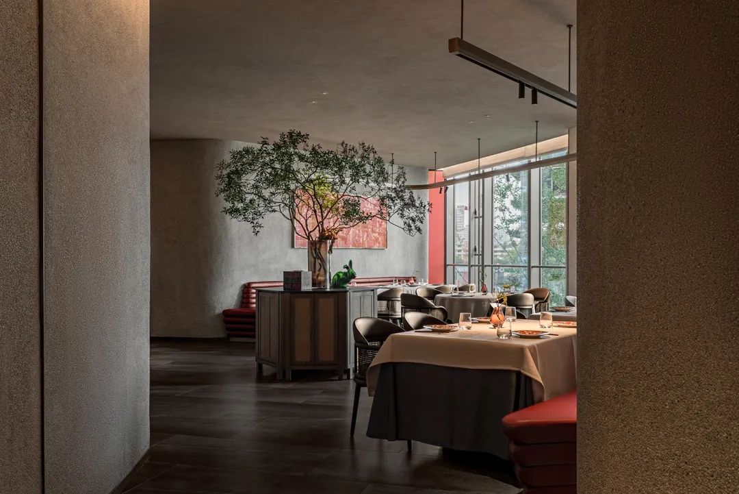
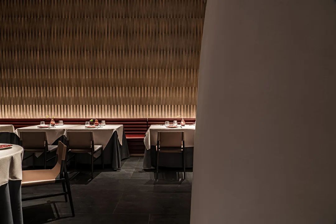
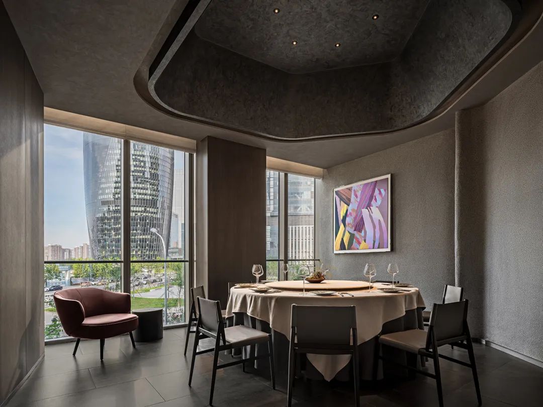
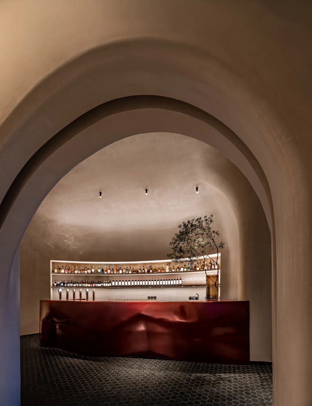
现代性中质朴的烟火气则来自材料上的细致把控。上世纪七八十年代广泛使用的水砂石材料和现代微水泥结合,在空间中拉出层次。
颗粒度的细微变化带来身处其中的情绪转化——光滑的现代感中适量混入粗糙颗粒,如同划过我们情绪肌肤的温暖沙粒,温暖的时光感与源于市井的烟火气合二为一,触发眷恋。
The rustic pyrotechnics in modernity come from the careful control of materials. The widely used water sand and gravel materials in the 1970s and 1980s are combined with modern micro-cement to pull out layers in the space.
Subtle changes in granularity bring about the transformation of emotions in it—a moderate amount of rough particles mixed with smooth modernity, just like the warm sand passing through our emotional skin, the warm sense of time combined with the fireworks from the market. One, trigger attachment.
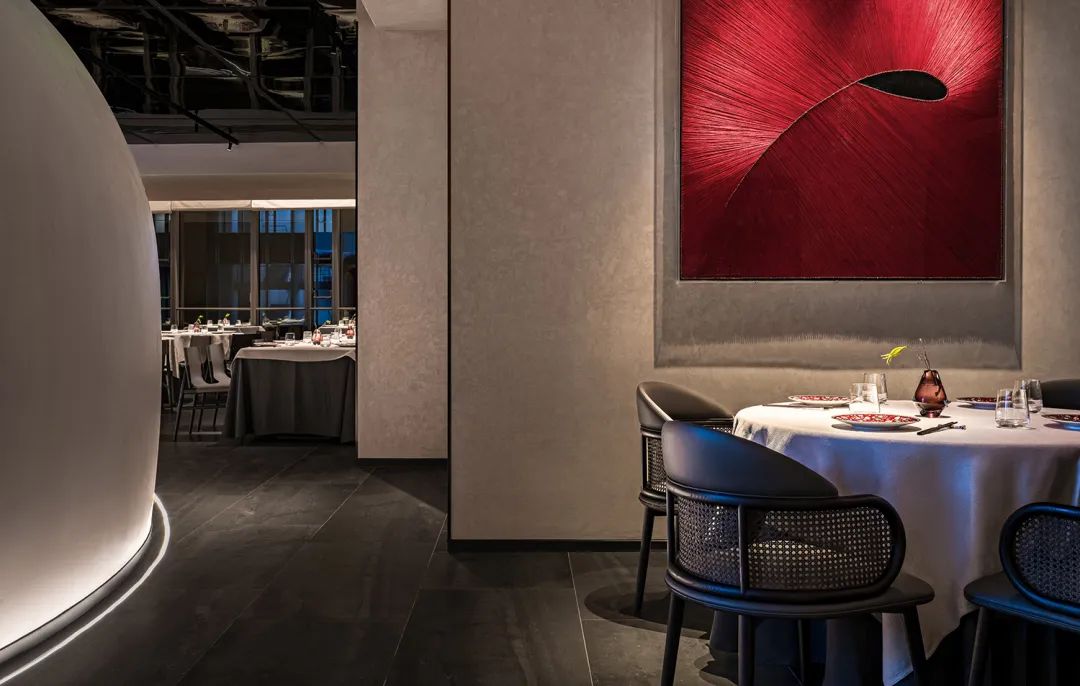
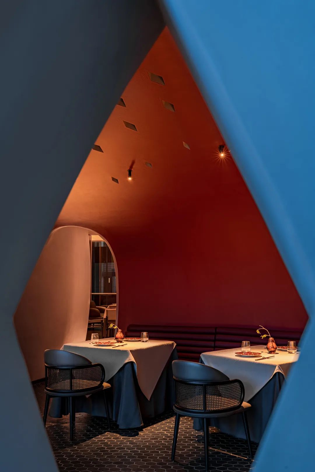
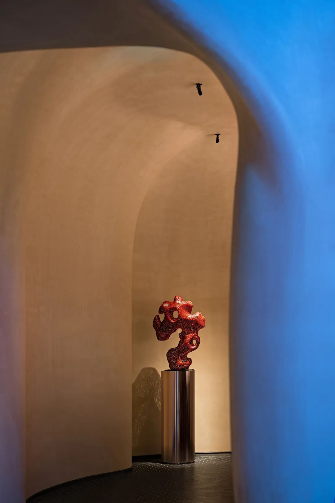
红色纯粹鲜明地以大块面或艺术品形式渲染、点缀,在艺术馆般的灰白层次里搅动起喜庆、活力和辛辣的味觉,直到视线落到芙蓉花浅盘。由虚向实、亦旧亦新的一支空间舞曲婉转收尾——食客落座、炉灶沸腾、辛香炸开、食指大动。
Red is pure and bright, rendered and embellished in the form of large pieces or artworks, stirring up festive, energetic and spicy tastes in the gray and white layers of art museums, until the sight falls on the hibiscus flower platter. From virtuality to reality, a space dance music that is both old and new ends gracefully - the diners are seated, the stove is boiling, the spices are exploding, and the index finger is moving.
02. 策略
策略为先情绪为后 | Strategy First Design Follows
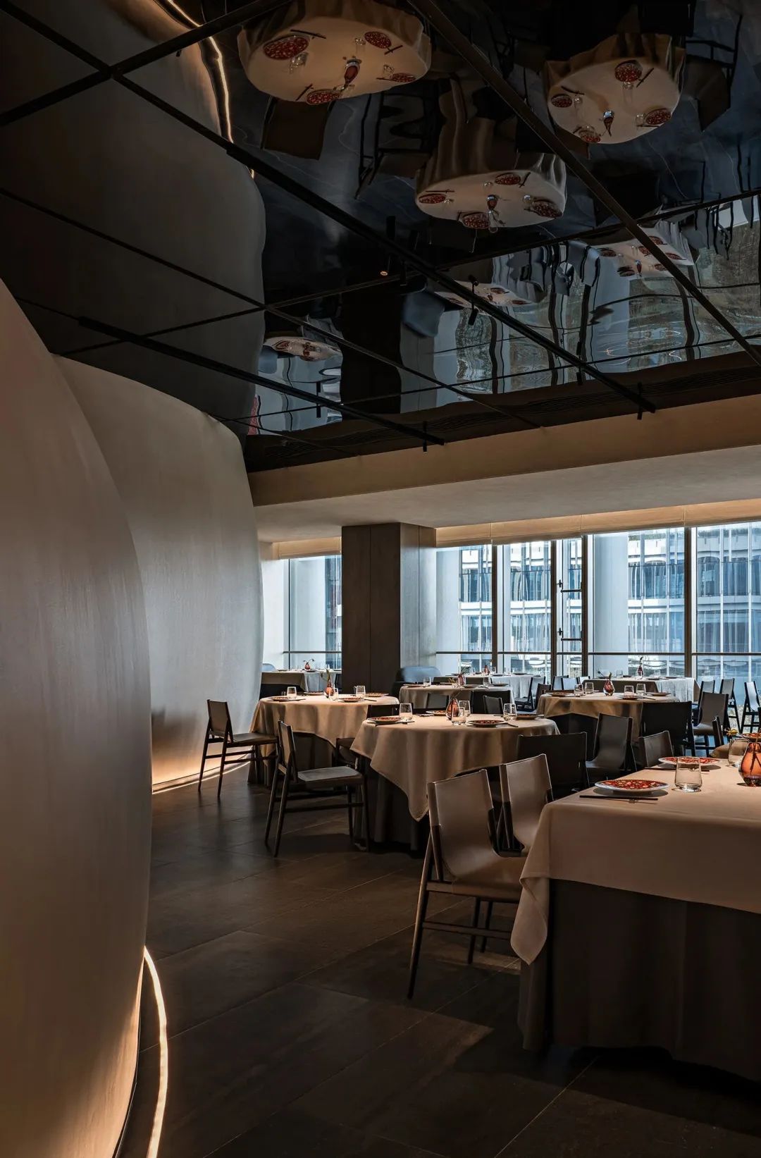
如何通过塑造空间在食客心中打上深刻的记忆点,而进一步形成品牌是本案设计策略的出发点。
通过在空间中创造具有强烈视觉吸引力的主体,覆盖以往模糊不清的品牌画像,完成让人记住的关键一步。另一方面则深挖品牌基因与城市文化及自然的关联,力求在更深层扎根,让鲜明的品牌记忆点能够源源不断吸取养分、生长壮大。
How to create a deep memory point in the hearts of diners by shaping the space, and further form the brand is the starting point of the design strategy of this case.
By creating a strong visually appealing subject in the space, covering the previously blurred brand image, a key step in making people remember is completed. On the other hand, it digs deep into the relationship between brand genes and urban culture and nature, and strives to take root at a deeper level, so that distinct brand memory points can continuously absorb nutrients and grow stronger.
项目信息
Name/项目名称:潇湘码头·渔宴 丽泽店
Location/项目地点:中国·北京
Area/项目面积:718㎡
Design/室内设计:IN.X屋里门外设计
Creative/设计主创:吴为
Team/设计团队:刘晨阳、贾琦峰、周信\应哲光、宋江丽
Light/ 灯光顾问:北京光度科技
Material/主要材料:青砖、老榆木板、铜板、肌理漆
Photography/项目摄影:郑焰
Copywriting/文案策划:NARJEELING那几岭
Plan/项目策划:楽品牌策略机构
扫描二维码分享到微信